Invasion of the 1970's Recreational Vehicles
>
If I were to pick one item to demonstrate 70's interior decor, I think it'd be a motorhome brochure. They looked similar to home decoration, but the enclosed space makes it all the more shocking. It's almost too much to take in at once. It's an all out assault on the eyes; it's everything bad about 1970's decor condensed.
Here we have a vast sea of browns accented by more browns. The only primary colors to be found are a bowl of fruit and this boy's Troube game. Not sure why everyone is laughing at him or why he is having to play this alone. Kind of disturbing, really.
This was pure heaven back in 1973 - an eight-track player, a cup holder for your Schlitz, shag carpet, and plaid seats.
Speaking of shag carpet - they didn't make 'em much thicker than this, folks. It's like a field of wheat.
Grandma, your purple clothes are clashing big time with the avocado green, brown and harvest yellow. Move it!
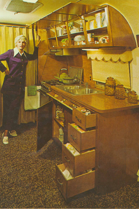
What an awful way to present this RVs interior decoration. They were going for "elegant", they got "yard sale" instead.
You know it's bad when there's a perfectly good bed, and your woman chooses to sleep in a compartment in the roof. Is she drinking coffee?
Apparently, it was a big selling point to show the customer there's still room for the wife to primp.
Plenty of room to chow down on some whole fruit and whole wheat bread. But where's the Pop Tarts and Sunny D?
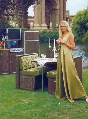
To hell with roughing it! This couple gets dressed up to the nine and breaks out their silver plated tea sets.
The bathroom is roomy, I'll give 'em that. But the decor is awful! Even the topless woman can't recue this eyesore.
And speaking of topless women in motorhome brochures....
Winnebagos and candelabras go well together, don't you think?
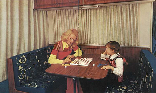
What game are they playing? Looks something like Othello.
Well, I've had about all the avocado green and harvest gold I can handle. Time to call it a wrap. Happy trails.


Wednesday, March 31, 2010
Retrospace: Invasion of the 1970's Recreational Vehicles


Tuesday, March 30, 2010
Patent Points to Camera-Based Swipe Controls For iPhone - Iphone 4 - Gizmodo
Patent Points to Camera-Based Swipe Controls For iPhone
With a new iPhone expected to debut this summer, Apple's phone-related patents start to take on added weight. Especially when they're as badass as the one unveiled yesterday that turns the iPhone's camera into a swipe pad.
The technology described in the patent, dug up by the diligent folks at Patently Apple, would allow an iPhone user to fast forward and rewind through voicemails, navigate web pages, or scroll through contact lists and iTunes simply by swiping one finger against the iPhone's camera.
The proposed controls would also be tap sensitive, meaning that you can access different phone or UI functions simply by tapping the camera with your forefinger. Theoretically, all of these controls would also apply to the iPad... should it ever, you know, get a camera.
The patent was originally filed in Q3 of 2008, which may have left just enough time for Apple to have implemented the tech by this summer. Let's hope so... this is one of those patents that actually seems as functional as it does cool. [Patently Apple]
Send an email to Brian Barrett, the author of this post, at bbarrett@gizmodo.com.


via gizmodo.com
Monday, March 29, 2010

Sunday, March 28, 2010
Reeder 2.0: Finally, An Awesome iPhone Feed Reader Arrives
TechCrunch

 One of about a half dozen tabs that I always have open in my web browser on my desktop or laptop is Google Reader. Even though other sources such as Twitter and Facebook are now better at uncovering news more quickly, Reader remains a great catch-all backup plan for the content I read online. But I’m increasingly finding myself browsing for news on my iPhone. And sadly, all the Google Reader applications that have launched over the past few years have, in my opinion, sucked. And I’m hardly the only one who thinks that. But that changes, today.
An app called Reeder, by Silvio Rizzi, has always been a nice-looking app that syncs with Google Reader. Unfortunately, it has also been clunky, and slow, and lacking some features such as state-saving. But the latest version, 2.0, which just went live in the App Store last night, corrects all the issues I had with it. It’s wonderful. I have absolutely no doubt this will be one of my most-used apps now. In fact, I’m so sure of it, that I’ve already placed it on my the first page of apps on my iPhone screen.
So what makes it so good? Well, first of all, it’s simple. Rather than trying to cram is all of the clutter items that Google Reader itself now crams into its own site, Reeder focuses on three key areas: Unread items, Starred items, and All items. These are the three key areas across the bottom of the app. The only other icon down there (on the main screen) is a reload button to load in new feed items. Assuming you group your feeds into folders in Google Reader, navigation is Reeder focuses on that. So, for example, when I click into my “tech” folder, I see all the unread feed items that have appeared since the last time I opened Google Reader. I can sort these by individual feeds or by time in which the items came in.
Obviously, clicking on an individual story loads that item (including any images). And in the story-view mode you have a new set of options along the bottom that let you mark an item as unread, star it, or a button to load a range of great Reeder features. For example, on this overlay menu, you can make a Google Reader note about an item, you can share it with your Reader friends, you can save it to Instapaper, you can send it to Twitter, you can open it in Safari, you can mail it to someone, etc. There are a half dozen other features which you can customize in the app.
But maybe my favorite feature of Reeder is the Tweetie-like ability to swipe an individual feed item to do something. In Tweetie, when you swipe a tweet, a bunch of options are shown under that tweet. In Reeder, it’s a bit different. Swiping right toggles an item between read and unread status. Swiping left toggles between starred and unstarred status. It’s brilliant. (And yes, there is also a button to mark all as read.)
As you’d expect, Reeder gives you the ability to sync feed items locally so that you can read them when you don’t have an Internet connection, such as on a plane. Previously, as I mentioned, syncing was slow. With version 2.0, syncing speed screams. And, there is also an option to only cache images if you’re connected to WiFi, to keep things moving alone.
If you haven’t been using the iPhone for a long time, news of a great feed reader may sound lackluster to you. After all, it’s been almost two years since the launch of the App Store now, it may be hard to believe that no one has nailed a simple feed reader app yet. But that has been the case. A few are okay, like NetNewsWire and Byline, but none have been great on the level that Tweetie is great as an iPhone Twitter client. In fact, I’d say the best feed reader on the iPhone up until now has been the mobile web version of Google Reader itself. But that too is only good, not great.
With Reeder 2.0, I think we finally have a great iPhone feed reader. Its combination of speed, simplicity, and beauty make it a must-have app in my opinion. Now the only hard part will be waiting for a native iPad version to come out that supports things like dual-pane views to more easily go through feed items on the larger screen. But now I’m just being greedy. I’m just happy to finally have a solid feed reader on the iPhone.
You can find Reeder 2.0 in the App Store here. It’s $2.99.


Sent with Reeder
Sent from my iPhone
Saturday, March 27, 2010


Friday, March 26, 2010


Subscribe to:
Posts (Atom)